Most marketers I meet are still copying numbers from GA4 into a spreadsheet every Monday morning. It’s slow, it breaks the moment someone renames a column, and the result looks like a tax form. There’s a better way, and it’s free: a Looker Studio dashboard wired straight into your data.
When I built my first proper reporting dashboard for a SaaS client, the weekly reporting ritual went from two hours of manual export-and-format to a single shared link that updated itself. The marketing lead stopped asking me for screenshots. She just bookmarked the dashboard and checked it whenever she wanted. That shift — from pushing reports to pulling answers — is the whole point.
This guide walks you through building a live Looker Studio dashboard from scratch: connecting GA4, choosing the right charts, laying out a page that executives actually read, and avoiding the mistakes that make dashboards slow and confusing. Further down there are three finished dashboard examples — marketing reporting, sales, and social — that you can rebuild tile by tile, plus how to copy someone else’s template without breaking every chart on the page.
Table of Contents
- What Looker Studio Is (and Isn’t)
- Before You Start: Plan the Dashboard
- Connect GA4 as a Data Source
- Build the Layout: Three Bands on One Page
- Choose the Right Charts for the Question
- Add Date Ranges and Filters
- Share and Schedule the Dashboard
- Three Looker Studio Dashboards Worth Copying
- Start From a Template Instead of a Blank Canvas
- Common Mistakes to Avoid
- Frequently Asked Questions
What Looker Studio Is (and Isn’t)
Looker Studio (formerly Google Data Studio) is a free reporting tool that pulls data from sources like GA4, Google Ads, Search Console, BigQuery, and spreadsheets, then turns it into interactive charts and tables on a shareable page. Think of it as the layer that sits on top of your raw data and makes it readable.
It is not a data warehouse, and it’s not built for heavy number-crunching. Looker Studio reads from your connectors and visualizes what’s there. If your GA4 events are a mess, your dashboard will faithfully visualize that mess. The tool is only as good as the tracking underneath it — which is why a clean GA4 event tracking setup matters before you ever open the dashboard editor.
A dashboard doesn’t fix bad data. Get your tracking right first, then let Looker Studio surface it. Garbage in, beautiful garbage out.
Before You Start: Plan the Dashboard
The biggest mistake people make is opening the editor and dragging charts around until it looks busy. A useful dashboard starts with a question, not a chart. Before you build anything, answer three things.
- Who reads this? A CEO wants three numbers and a trend. An analyst wants twenty rows and a filter. Build for one audience per page.
- What decision does it support? “Should we keep funding this channel?” is a decision. “How many sessions did we get?” is trivia. Every chart should help someone decide something.
- What’s the time frame? Weekly check-ins need week-over-week comparisons. Quarterly reviews need 90-day trends. Pick one cadence and design for it.
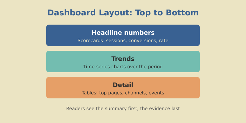
I sketch the layout on paper first — a hero row of key numbers at the top, trend charts in the middle, detailed tables at the bottom. Top-left gets the most important metric because that’s where eyes land first.
Connect GA4 as a Data Source
Open Looker Studio and create a blank report. You’ll be prompted to add data. Choose the Google Analytics connector, authorize access, and pick the GA4 property you want to report on.
A few things to get right at this stage:
- Use a GA4 property, not a Universal Analytics one. The connectors look similar, but UA data stopped collecting and won’t reflect anything current.
- Confirm the property matches the site. If you manage several sites, the property names blur together. Double-check before you build twenty charts on the wrong data.
- Check default date handling. Looker Studio defaults to “Auto” date range. I always swap this for a fixed control so readers can change it themselves.
You can connect more than one source to a single report — GA4 plus Search Console plus Google Ads — but start with one. Adding sources later is easy; untangling a confused dashboard is not.
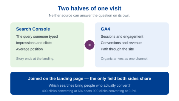
Sooner or later two of those sources need to sit in the same table — GA4 sessions next to Search Console clicks for the same landing page. That is a blend, and it has hard edges worth knowing before you design a page around it. A blend holds up to five tables, and its join conditions accept equality only: Field A = Field B works, anything else is not an option. Choose the join key badly and the totals stop matching without telling anyone. I walk through the whole thing, including the two mistakes that quietly break the numbers, in the guide to blending GA4 and Search Console data in one dashboard.
Build the Layout: Three Bands on One Page
Set your page size first. A standard US-letter landscape canvas (roughly 1200 by 900 pixels) works well for desktop viewing and prints cleanly. Add a header text box with the report name and a logo so the dashboard looks owned, not improvised.
Then block out three zones with simple background rectangles:
| Zone | Purpose | What goes here |
|---|---|---|
| Top band | Headline numbers | 4–6 scorecards: sessions, conversions, conversion rate, key events |
| Middle band | Trends | Time-series charts showing direction over the period |
| Bottom band | Detail | Tables: top pages, top channels, top events |
This top-to-bottom flow mirrors how people read — the summary first, the story second, the evidence last. It also means a busy executive can stop after the top band and still walk away informed.
Choosing which four to six numbers earn the top band is harder than laying it out. My rule: a metric belongs there only if a plausible move in it would change what the team does next week. The longer version, including the metrics that look important and are not, is in the guide to which metrics belong on a marketing dashboard.
Freeform or Responsive: Decide Before You Build
Looker Studio gives you two layout modes, and switching later costs you work. Freeform is the classic fixed canvas: you place components wherever you like and set the page size yourself, anywhere from 10 by 10 pixels up to 2000 pixels wide. Responsive mode drops the fixed canvas for a 12-column grid that reflows to the width of whatever device the reader is holding.
If a real share of your audience opens the dashboard on a phone between meetings, responsive is the right call — but it trades away features you may be counting on. No lines or arrows. No grouping components; sections do that job instead. No overlapping elements, no “Fit to width” display mode, and no two people editing at the same time. Converting an existing freeform report costs you formatting as well: chart positions, background fills, and borders can be lost in the switch. Pick the mode on day one under Theme and layout → Layout → Layout mode, not after you have placed forty components.
Choose the Right Charts for the Question
Chart choice is where most dashboards go wrong. The rule is simple: match the chart to the question. Here’s the mapping I use for nearly every marketing dashboard.
| You want to show… | Use this chart |
|---|---|
| A single current number | Scorecard (with comparison to prior period) |
| Change over time | Time-series line chart |
| Parts of a whole | Bar chart (avoid pie charts for more than 3 slices) |
| Ranked detail | Table, sorted descending |
| Two metrics correlated | Scatter or combo chart |
For the top band, use scorecards and turn on the comparison option — Looker Studio will show the percentage change versus the previous period automatically. A number without context is noise; “12,400 sessions, up 18%” is a story.
The goal of visualization is insight, not pictures. If a chart doesn’t help the reader make a decision faster, it’s decoration, and decoration is a tax on attention.
Digital Marketing Specialist, mousaw.com
For the middle band, line charts beat everything for showing trends. Plot sessions and conversions over time, and your reader instantly sees whether things are climbing or sliding. For the bottom band, tables sorted by the most important column let people scan for the top performers and the dead weight.
Chart type is only half of it. Whether readers trust the page comes down to the details underneath: one color per channel held constant across every chart, axes that start at zero, labels that name the unit, and no more ink than the data needs. Those rules do not change between tools, and I have collected them in data visualization best practices for clear charts.
Add Date Ranges and Filters
A static dashboard answers one question. A dashboard with controls answers dozens. Add these two controls to the top of every page:
- Date range control: Lets the reader switch between last 7 days, last 28 days, last quarter, or a custom window without you rebuilding anything.
- Filter control: A dropdown to filter by channel, device, country, or landing page. This turns a single dashboard into a self-serve analytics tool.
When I added a simple channel filter to a client’s dashboard, the questions I got dropped by half. People stopped asking “how did organic do?” because they could just select it themselves. Controls move the work from you to the reader — exactly where it belongs.
Every control you add is a question you’ll never have to answer manually again. Build the dashboard once, reclaim your Mondays forever.
Share and Schedule the Dashboard
Sharing works like a Google Doc. Click Share, set viewers to “anyone with the link can view” (or restrict to specific emails), and send. Viewers see live data without needing a Looker Studio account or access to your GA4.
For stakeholders who prefer inboxes to links, use the scheduled email delivery feature. Looker Studio renders the dashboard as a PDF and emails it on a cadence you set — every Monday at 8am, say. This is the closest thing to “set it and forget it” reporting you’ll find for free.
One practical tip: keep an editor copy and a viewer copy mentally separate. Never hand edit access to people who only need to look. One accidental drag and your carefully built layout is gone.
Three Looker Studio Dashboards Worth Copying
“Just show me an example” is the request I get most often after explaining the process, and it is a fair one — a blank canvas is intimidating in a way that a filled one is not. The three below cover most of what a marketing team actually needs. Each fits on a single page, each uses the three-band structure from earlier, and each takes an afternoon to assemble the first time and twenty minutes every time after that.
Three dashboard blueprints
Same three-band structure, different question, different sources
- Top band Sessions · Key events · Conversion rate · Organic clicks
- Middle band Sessions by channel over time · Clicks against impressions
- Bottom band Landing pages by key events · Queries by clicks
GA4 + Search Console
For the marketing lead
- Top band Revenue · Orders · Average order value · Purchase rate
- Middle band Revenue against prior period · Revenue by channel
- Bottom band Products by revenue · Channels by revenue
GA4 ecommerce, or a Sheet from the CRM
For the founder or sales lead
- Top band Followers · Posts published · Engagements · Social sessions
- Middle band Engagement by platform over time
- Bottom band Posts by engagement · Landing pages from social
Google Sheet + GA4
For the social or content manager
Every source named here is either a Google-built connector or a plain Google Sheet, so none of these three cost anything beyond a Google account.
A Marketing Reporting Dashboard in Looker Studio
This is the page most people mean when they say marketing dashboard: how much traffic arrived, where from, and what it did. Two sources cover it — GA4 for behavior on the site, Search Console for what happened in the results page before the click.
One wrinkle in Search Console costs people an afternoon if nobody warns them. The connector offers two tables, Site Impression and URL Impression, and a single data source can only use one of them. Site Impression aggregates at property level, which is what the headline clicks-and-impressions scorecards want. URL Impression breaks the same data down by page, which is what the bottom-band table wants. If your page needs both, build two data sources against the same property and point different charts at each.
Top band: sessions, key events, conversion rate, and organic clicks, each with the prior-period comparison switched on. Middle band: one time series of sessions split by default channel group, and one of clicks against impressions — that second chart tells you whether a flat click line is a ranking problem or a demand problem, which is a distinction most reports never make. Bottom band: landing pages sorted by key events, and queries sorted by clicks. Six charts, one page, and it answers nine of the ten questions a marketing lead has on a Monday morning.
A Sales Dashboard in Looker Studio
Sales dashboards split into two cases, and the honest answer is different for each.
If you sell online and your ecommerce events fire correctly, GA4 already holds everything the page needs: purchase revenue, transactions, items, and the channel that drove each one. The top band takes revenue, orders, average order value, and purchase rate. The middle takes revenue against the previous period plus revenue by channel — that second chart is the one that ends budget arguments. The bottom takes two tables, products by revenue and channels by revenue.
If you sell B2B with a pipeline, GA4 knows nothing about a deal that closes on a call three weeks after the visit, and no chart configuration will conjure that data into existence. The pragmatic build is a Google Sheet the sales team already maintains — one row per deal with stage, value, owner, and close date — connected as a data source and refreshed on a schedule. It feels unglamorous next to a proper CRM integration, and it ships the same day. Salesforce, HubSpot and the rest reach Looker Studio through community connectors written by third-party developers rather than by Google, so check what the connector costs and who maintains it before a dashboard your CEO reads depends on it.
A Social Media Dashboard in Looker Studio
Social is the awkward one, because the platforms holding the data are mostly platforms Google does not connect to itself. YouTube Analytics has a Google-built connector. Facebook, Instagram, LinkedIn and X arrive through community connectors written by third parties — perfectly usable, but read the terms before you build a page on one.
The version I build when nobody wants to pay for a connector: a single Google Sheet, one row per platform per week, filled in by whoever runs social, with followers, posts published, reach, and engagements. Connect that sheet, add GA4 alongside it, and the page writes itself — platform metrics across the top, engagement by platform over time in the middle, and at the bottom a GA4 table of landing pages that received sessions from the Organic Social channel group.
One rule for this page, and it is not negotiable: never add a platform’s numbers to GA4’s numbers. Instagram counts a reach; GA4 counts a session that arrived from Instagram. Those are different events, measured by different parties, under different definitions. A scorecard that sums them is worse than no scorecard, because it looks authoritative. Keep platform data and site data in separate bands, label both, and let the reader hold the two side by side.
Start From a Template Instead of a Blank Canvas
Building from scratch teaches you the tool. Building from a template gets you a working page before lunch. Both are legitimate; the mistake is not knowing which one you are doing.
Google runs a Report Gallery — a showcase of reports and dashboards that people have submitted — and any report can be turned into a template by appending /preview to its URL. Open one of those and “Edit and share” copies it into your own Drive. On an ordinary report, the same job is done by Make a copy in the top-right menu.
Here is the part that catches everyone: copying a report does not copy its data sources. The copy dialog lists the original’s sources on the left and asks you to pick yours on the right. Choose sources with the same structure — a GA4 property where the template used a GA4 property — or the charts land on the page without the dimensions and metrics they were built against, and half of them break instantly. That is also why one “free GA4 dashboard” from a vendor works the moment you copy it, and another does not: the first was built on the GA4 connector you already have, the second on the vendor’s own connector, which you do not.
If you rebuild the same dashboard for client after client, there is a faster road. The Looker Studio Linking API lets you hand someone a URL that creates the report from your template with their data source already configured — c.reportId names the template, and ds. parameters carry the connector and its settings. One link, no setup screens, the same layout every time.
Common Mistakes to Avoid
After building dozens of these, here are the traps I see most often — and how to dodge them.
- Too many charts. A page with 20 charts says nothing. Cut to the 6–8 that drive decisions. If a chart hasn’t changed a decision in three months, delete it.
- No comparison context. Raw numbers are meaningless. Always show change versus the prior period or a target.
- Slow dashboards. Pulling huge date ranges or connecting too many sources makes pages crawl. Shorten the default range, split heavy reports across pages, and snapshot the slow sources into a data extract — an extract holds up to 100 MB and 750,000 rows, which covers most marketing reporting and loads far faster than querying the source on every visit.
- Inconsistent colors. If organic is blue in one chart and green in the next, readers get confused. Pick a color per channel and keep it everywhere. Clean content marketing ROI reporting depends on this kind of visual consistency.
- No clear owner. Dashboards rot. Assign someone to review yours quarterly and prune dead charts.
Get those right and your dashboard becomes the single source of truth your team actually trusts — not another tab nobody opens.
Frequently Asked Questions
Build It Once, Use It Forever
A good Looker Studio dashboard pays for itself the first week. You stop exporting spreadsheets, stop emailing screenshots, and stop answering the same questions over and over. The data is live, the link is shared, and your team self-serves.
Start small. Connect GA4, build one page with a scorecard row, a trend chart, and a top-pages table. Add a date control and a channel filter. Share the link. Once that page earns its keep, layer on Search Console and Google Ads data, more pages, more filters. The template grows with you.
One distinction worth keeping straight as you go: a dashboard and a report are not the same artifact. The dashboard is the live surface people check whenever they want the current state; the report is the argument you make about what it shows, with a recommendation attached. If stakeholders keep looking at your beautiful page and asking “so what does this mean?”, the missing piece is the second one — I have covered that handoff in how to build a marketing report that drives decisions.
The marketers who win aren’t the ones with the fanciest tools — they’re the ones who turn data into decisions fastest. A clean dashboard is the shortest path between a number and an action. Build yours this week, and make Monday mornings boring again.