
I once inherited a marketing dashboard with 47 metrics on a single screen. It tracked everything and explained nothing. Nobody on the team could tell me, in one sentence, whether the month was good or bad. That’s the paradox of dashboards: the more you measure, the less you understand.
The fix isn’t a fancier tool. It’s discipline about which marketing dashboard metrics earn a spot. A great dashboard is mostly empty space surrounding a handful of numbers that actually drive decisions. The art is knowing which numbers those are.
In this guide I’ll break down the metrics that belong on a marketing dashboard, how to organize them by the question they answer, and how to design a layout that turns data into action. This is the companion to building the dashboard itself — once you know what to track, the wiring is the easy part.
Table of Contents
Vanity Metrics vs. Actionable Metrics
Every metric falls into one of two buckets. Vanity metrics feel good but don’t change behavior — total pageviews, social followers, raw impressions. Actionable metrics tie to a decision — cost per acquisition, conversion rate, qualified leads. The first kind makes you feel busy. The second kind makes you effective.
The test I use is brutal and simple: If this number doubled or halved, would I do something different? If the answer is no, the metric is decoration. Pageviews can triple while revenue stays flat. That’s why a number like “sessions” belongs in the supporting detail, not the headline.
A metric earns a place on the dashboard only if a change in it would change what you do next. Everything else is reference data, not a headline.
The Three Layers of a Dashboard
The clearest way to organize marketing dashboard metrics is by the stage of the customer journey they measure. Every funnel, no matter how you slice it, has three layers: getting people in, keeping them engaged, and turning them into customers.
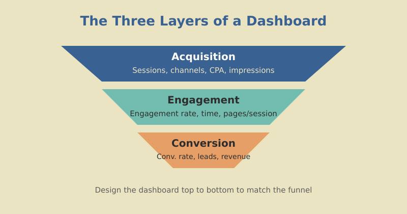
Design your dashboard to mirror this flow, top to bottom. Acquisition metrics sit highest because they’re the widest part of the funnel. Conversion metrics anchor the bottom because they’re closest to revenue. When a number drops, the layout tells you instantly which stage broke.
Acquisition Metrics
Acquisition answers: Are we reaching the right people, efficiently? The headline metrics here are about volume and cost.
| Metric | What it tells you | Watch for |
|---|---|---|
| Sessions by channel | Where traffic comes from | Over-reliance on one channel |
| New vs. returning | Reach vs. loyalty balance | Falling new-visitor share |
| Cost per acquisition (CPA) | Efficiency of paid channels | Rising CPA with flat conversions |
| Organic impressions | SEO visibility trend | Sudden drops after algorithm shifts |
The most useful acquisition view isn’t a single number — it’s the channel mix over time. If 80% of your traffic comes from one source, you’re one algorithm update away from a bad quarter. A healthy dashboard makes that concentration risk visible at a glance. This is exactly the kind of structural signal that good SEO strategy work is meant to diversify.
Engagement Metrics
Engagement answers: Do people actually find value once they arrive? This is the layer most dashboards neglect, and it’s where the early warning signs live.
- Engagement rate: The share of sessions where someone stayed, scrolled, or interacted. In GA4 this replaced the old bounce-rate framing and is far more honest.
- Average engagement time: How long people genuinely spend with your content, not just how long the tab was open.
- Pages per session: Whether your internal linking pulls people deeper into the site.
- Key event completions: Micro-conversions like signups, downloads, or video plays that signal real interest.
Engagement is the bridge between traffic and revenue. A page that pulls thousands of visits but no engagement is a leak. When I audit a site, I look here first — it’s where you find the content that ranks but doesn’t resonate.
Engagement metrics are the canary in the coal mine. Traffic tells you the top of the funnel is working. Engagement tells you whether the middle is quietly falling apart before revenue ever notices.
Digital Marketing Specialist, mousaw.com
Conversion and Revenue Metrics
This is the layer executives care about most, so it earns the top-left scorecard. Conversion answers the only question that pays the bills: Is the marketing turning into money?
| Metric | Why it matters |
|---|---|
| Conversion rate | The efficiency of your whole funnel in one number |
| Qualified leads (MQL/SQL) | Volume of pipeline, not just clicks |
| Cost per lead | How much each opportunity costs to generate |
| Revenue attributed to channel | Which efforts actually drive sales |
The trap here is treating conversion rate as a single sacred number. Always pair it with volume. A 10% conversion rate on 50 visitors is five customers; a 2% rate on 10,000 visitors is two hundred. Rate without volume — and volume without rate — both lie. Show them together. For a deeper treatment of tying these back to dollars, see how to measure content marketing ROI.
Pair every rate with its volume and every total with its trend. A number alone is a guess; a number in context is a decision.
Designing for the Reader
Picking the right metrics is half the job. Presenting them so the right person reads them correctly is the other half. A few principles I never break:
- One audience per page. Executives get five numbers. Analysts get a separate page with the detail. Mixing them serves neither.
- Most important metric, top-left. Reading patterns put the most attention there. Don’t waste it on a logo.
- Always show comparison. Versus last period, versus target, versus last year. A bare number is unreadable.
- Color means something. Use one accent for “good,” one for “bad,” and keep them consistent. Don’t decorate — signal.
- Round aggressively. “12.4K” is faster to read than “12,438.” Precision the reader can’t use is just clutter.
The goal is a dashboard a stranger could read in ten seconds and correctly say “good month” or “bad month.” If they can’t, you have too many metrics or too little context.
Match Metrics to Cadence
Not every metric belongs on every dashboard, because not every metric moves at the same speed. Match the metric to how often you review it.
| Cadence | Best metrics | Why |
|---|---|---|
| Daily | Sessions, paid spend, signups | Catch breakage fast |
| Weekly | Conversion rate, CPA, channel mix | Spot trends, adjust tactics |
| Monthly/Quarterly | Revenue attribution, CAC, pipeline | Strategic decisions, budget |
Putting a slow metric like quarterly revenue on a daily dashboard just adds noise — it barely moves day to day. Putting a fast metric like daily spend on a quarterly review hides the moments it spiked. Right metric, right rhythm.
Frequently Asked Questions
Measure Less, Understand More
The best marketing dashboard metrics aren’t the most metrics — they’re the right ones, arranged so the story reads itself. Acquisition at the top, engagement in the middle, conversion at the bottom. Each number paired with context. Each metric matched to its cadence.
Go look at your current dashboard and run the test on every number: if this doubled or halved, would I act? Cut everything that fails. What’s left is your real dashboard — the one that tells you, in ten seconds, whether to celebrate or course-correct.
Measurement is leverage, but only when it’s focused. A dashboard that tracks everything tracks nothing. Strip yours down to the metrics that move decisions, and you’ll find you understand your marketing better than you ever did with forty-seven charts fighting for attention.