
A chart’s only job is to make a number obvious. Yet most of the charts I see in marketing decks do the opposite — they bury the point under rainbow colors, 3D pie slices, and axes that start at a suspiciously flattering number. A bad chart isn’t just ugly. It quietly leads people to wrong decisions.
I learned this the hard way. Early in my career I presented a “growth” chart with a truncated y-axis. The bar looked like it had tripled. It had grown 4%. A senior colleague caught it, and I’ve been careful with axes ever since. Good data visualization best practices aren’t about making things pretty — they’re about making things true and fast to read.
This guide covers the principles that separate charts that clarify from charts that confuse: choosing the right chart type, using color with intent, designing honest axes, and stripping away everything that doesn’t help the reader. These rules apply whether you’re building a dashboard, a slide, or a report.
Table of Contents
Why Chart Design Changes Decisions
The human brain processes visuals far faster than text or tables. That speed is the whole reason charts exist — but it’s also why a misleading chart is dangerous. People believe what they see before they’ve consciously checked it. A chart that distorts the data plants a wrong conclusion before anyone reads the footnotes.
This matters most on dashboards and in reports, where decisions get made in seconds. If your chart makes a 4% gain look like a tripling, you’ve just helped someone over-invest in the wrong thing. The goal of data visualization best practices is to make the honest reading also the fastest reading.
A chart is an argument. The fastest visual reading should always be the most accurate one — anything else is a chart that lies efficiently.
Choose the Right Chart Type
Most chart mistakes start before any styling — they start with picking the wrong chart for the question. Each chart type is built to show one kind of relationship. Use the wrong one and the reader has to work to translate it.
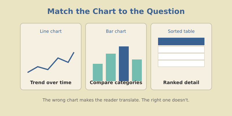
| The question | Best chart | Avoid |
|---|---|---|
| How did this change over time? | Line chart | Pie chart |
| How do categories compare? | Bar chart | 3D anything |
| What share of the whole? | Bar or stacked bar | Pie with 6+ slices |
| How are two metrics related? | Scatter plot | Dual-axis line |
| What’s the exact ranked detail? | Sorted table | Any chart |
The most overused chart in marketing is the pie chart. It’s fine for two or three slices, but humans are terrible at comparing angles. Past three categories, a sorted bar chart always reads faster. When you find yourself reaching for a pie, reach for a bar instead — your readers will thank you without knowing why.
Maximize the Data-Ink Ratio
Edward Tufte, the godfather of data visualization, coined the idea of the data-ink ratio: the proportion of a chart’s ink that actually represents data versus decoration. The principle is to delete anything that isn’t carrying information.
That means cutting:
- Gridlines down to faint, occasional reference lines — or removing them entirely.
- Backgrounds and borders that box in the chart for no reason.
- 3D effects and shadows, which distort proportions and add zero meaning.
- Redundant legends when you can label the data directly.
- Decimal places the reader can’t act on. Round to what matters.
Every element you remove makes the remaining data louder. I treat chart design like editing prose — the first draft is always too cluttered, and the work is in cutting. When in doubt, take it out and see if the chart still makes its point. It usually does.
Above all else, show the data. The best graphic is the one that gives the viewer the greatest number of ideas in the shortest time with the least ink in the smallest space.
Author, The Visual Display of Quantitative Information
Use Color With Intent
Color is the most abused tool in charting. Default palettes hand you a rainbow, and people use every crayon in the box. But color isn’t decoration — it’s meaning. Each color should earn its place by encoding something.
Three rules keep color honest:
- Gray is your friend. Make most of the chart neutral gray, and use one bright color to highlight the single thing you want noticed. Contrast directs the eye better than rainbow ever will.
- Be consistent across charts. If “organic” is blue in one chart, it’s blue everywhere. Switching colors between charts forces re-learning every time.
- Reserve red for bad. Red reads as alert, danger, decline. Don’t waste it on a neutral category — save it for the numbers that should worry someone.
If everything is highlighted, nothing is. Use gray for context and one accent color for the point. Color should answer “where do I look first?”
One more thing: roughly 8% of men have some form of color blindness. Avoid relying on red-versus-green alone to carry meaning — pair color with labels, shapes, or position so the chart still reads for everyone.
Design Honest Axes
This is where charts most often deceive — sometimes by accident, sometimes not. The axis sets the frame, and a dishonest frame distorts everything inside it.
The cardinal rule: bar charts must start at zero. The whole point of a bar is that its length encodes the value. Truncate the axis and you break that encoding — a tiny difference looks enormous. Line charts have a little more freedom because they show trend rather than magnitude, but even then, a wildly zoomed axis exaggerates noise into drama.
| Axis choice | Effect on the reader |
|---|---|
| Bar chart starting at zero | Honest proportions, true comparison |
| Bar chart with truncated axis | Exaggerates small differences — misleading |
| Consistent axis across related charts | Fair comparison between panels |
| Different axes on side-by-side charts | Readers wrongly compare apples to oranges |
If you ever feel tempted to truncate an axis to make a result look more impressive, that’s the moment to stop. The reader will eventually notice, and the trust you lose is worth more than the drama you gain.
Label for Clarity, Not Decoration
A chart without context is a puzzle. Good labeling turns a puzzle into a sentence. The single highest-leverage habit is writing the chart title as the takeaway, not the topic.
Compare these two titles for the same chart:
- Topic title: “Monthly Organic Sessions” — accurate, but the reader still has to figure out the point.
- Takeaway title: “Organic Sessions Up 32% Since the Site Migration” — the chart now proves a claim instead of presenting raw data.
Label data directly where you can, so readers don’t bounce between a legend and the chart. Add a one-line annotation on the spike or dip that matters most. Context is what turns a chart from a wall of numbers into an argument someone can act on — the same way solid content hub structure turns scattered posts into a coherent story.
Common Mistakes to Avoid
Here are the offenders I flag most often when reviewing someone’s charts:
- Dual y-axes. Two scales on one chart let you imply any correlation you want. Almost always misleading — split into two charts instead.
- Too many series. A line chart with eight lines is spaghetti. Highlight one or two; gray out the rest.
- Pie charts with many slices. Already covered, but worth repeating because it’s everywhere.
- Missing units or time frame. “Revenue: 240” — dollars? thousands? this month? Always state it.
- Sorting by label instead of value. Alphabetical bars hide the ranking. Sort by the number unless order has inherent meaning.
Fix these five and your charts will already be clearer than most of what crosses a marketing executive’s desk.
Frequently Asked Questions
Let the Data Speak
Strong data visualization best practices all serve one goal: make the true reading the fast reading. Pick the chart that fits the question. Strip away decoration until only the data remains. Use color to point, not to decorate. Keep axes honest. Write titles that state the takeaway.
None of this requires design talent. It requires restraint. The best charts feel almost empty because everything that doesn’t carry meaning has been cut away. That emptiness is the point — it’s what lets the one number you care about land instantly.
Next time you build a chart, ask one question before you share it: What should the reader conclude in three seconds? If the chart answers that cleanly and honestly, it’s done. If it doesn’t, keep cutting until it does.